The shield within the ceremonial mark — the university seal — is the foundation of LMU's primary logo, as well as the Law School's primary lockup. The university logo is the most prominent mark in the visual identity system. Our logo is iconographic and represents a sophisticated system of synthesized lock-ups, which graphic marks combined with wordmarks as seen in Loyola Law School's lock-up. The logo bridges the ceremonial mark and the spirit mark, achieving visual integration.

The logo conveys core institutional and academic values, contemporized and simplified so that it functions across digital platforms and devices. Symbolism from our Jesuit and Marymount founding orders and our spirit mark bring 500 years of history into a contemporary graphic.
Drawing on the university shield, Law School lock-up is the most commonly used LLS logo in the LMU visual identity program. It is our graphic identity to external audiences, used in applications such as marquee signage, advertising, print and digital communications, apparel and the Law School's business package. It is available to download for immediate use in accordance with our graphic standards.
Clear Space
Adequate clear space for the primary lock-up is defined as the cap height of the M extended around its perimeter. No other graphics or text should interfere with this area.

Minimum Size
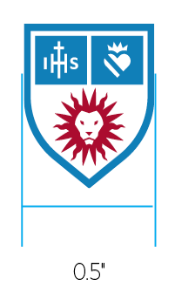
The minimum size of the primary mark is 0.5 inches. There is no maximum size use.

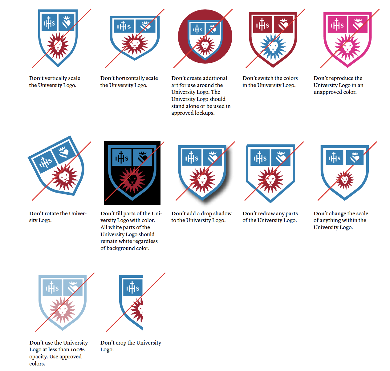
Incorrect Use
Incorrect uses of the primary mark are shown below. Incorrect usage rules apply to all marks in the LMU identity toolkit.
