The Athletics mark has been redrawn from its ancestor, a Gothic-inspired, typographic logo used from 1999-2018. The mark was simplified and contemporized for clarity and optimization on digital devices. Strengthened by a more vibrant color palette, the Athletics logo vividly and immediately conveys the LMU brand, lowering the barrier to name recognition for strengthened Athletics reputational awareness.

The typographical basis of the Athletics mark is a block, slab serif typeface altered on a curve, retaining the equity in the previous Athletics logo’s iconic shape. The Athletics identity features its own system of lock-ups that all programs lock into. The mark is visually integrated with the rest of the LMU brand and featured on uniforms, in playing arenas, signage, the Athletics business package and fan apparel.
The Athletics mark is used by LMU Athletics in such applications as official team uniforms, gear and equipment, spirit wear, signage, recruitment materials, and fan communications and promotions. It is not available by download. Usage requests are vetted by Marketing and Communications.
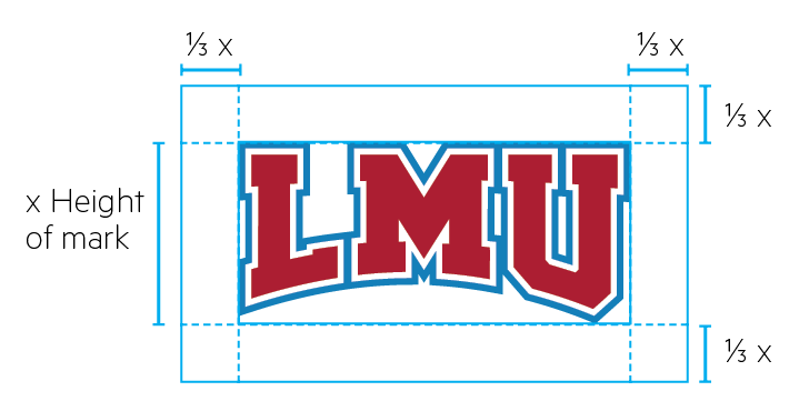
Clear Space
Adequate clear space for the Athletics mark is defined as 1/4 of its height extended around its perimeter. No other graphics or text should interfere with this area.
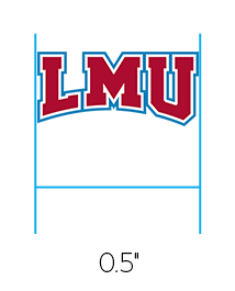
Minimum Size
The minimum size of the Athletics mark is 0.5 inches. There is no maximum size use.
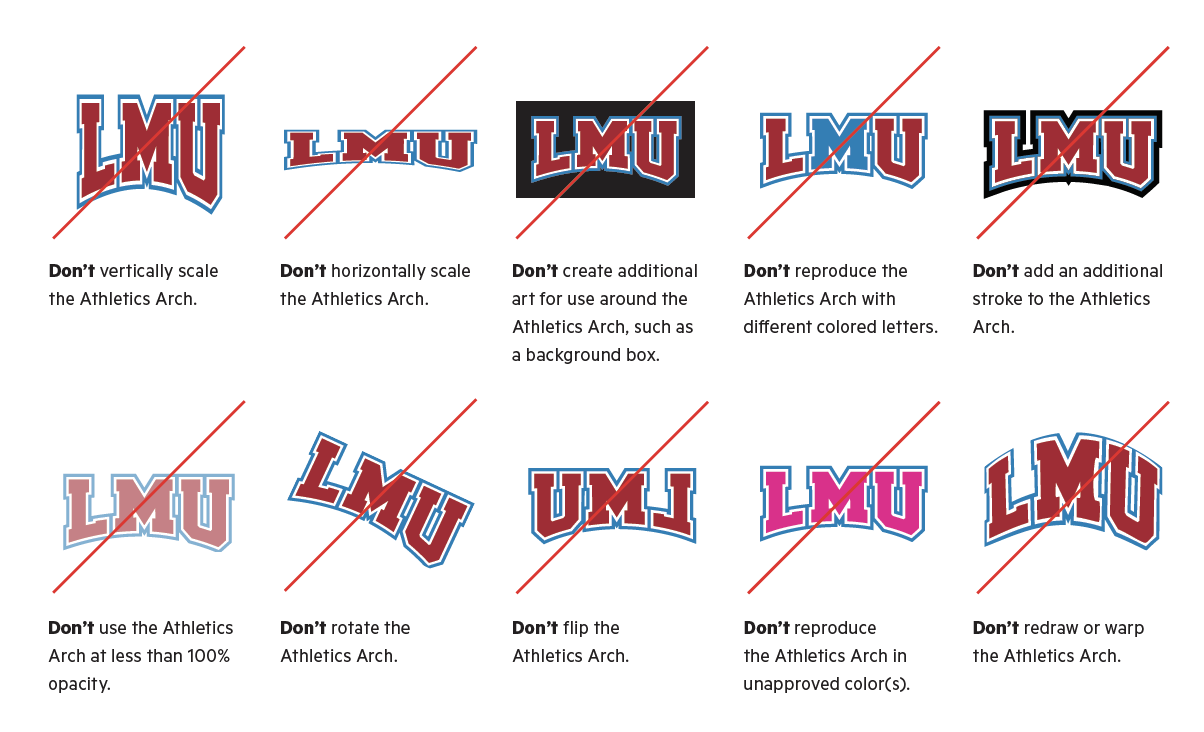
Incorrect Use
Incorrect uses of the Athletics mark are shown below. Incorrect usage rules apply to all marks in the LMU identity toolkit.