LMU Loyola Law School now adheres to LMU’s visual identity standards for typography and color. The color palette is grounded in the color traditions of the university's founding religious orders, the Society of Jesus (the Jesuits) and the Religious of the Sacred Heart of Mary (R.S.H.M.) LMU Crimson represents the Jesuit tradition and LMU Blue represents the R.S.H.M. and Marymount traditions.
The combination of both hues presents vivid, compatible color values that directly hearken back our history and identity.
Our color palette is distinctive. The brightened and more vivid values are screen and mobile adaptive, even visible on a black background.
Color Values & Equivalencies
Our color palette features specific prescriptions for various production processes and mediums. In addition to exact color mixes in the Pantone Matching System (PMS), there are precise values for cyan, magenta, yellow and black (CMYK) to achieve color accuracy in process printing. Last, six-digit hexidecimal codes are used when matching LMU colors on the web and in other digital environments (RGB).

C22 M100 Y84 K15
R171 G12 B47
#AB0C2F

C100 M38 Y17 K2
R16 G127 B184
#0076A5

C8 M5 Y7 K16
R200 G201 B199
#C8C9C7

C23 M16 Y13 K46
R136 G139 B141
#888B8D

C60 M60 Y40 K100
R0 G0 B0
#000000
Color Usage Ratios
LMU Crimson and LMU Blue should be used more than any other colors in the palette. The secondary colors are meant to act as complements to the primary colors, LMU Crimson and LMU Blue. The recommended ratio of use for all colors in the palette is shown here.

Logo Color Standards
Color is a critical component of any visual identity system. LLS is as identifiable by its Crimson and Blue tradition as any mark in its logo system. For this reason, it is critical that the color palette be deployed accurately.
Guidelines for acceptable logo color applications are shown here. The example used is the university primary lock-up but the guidelines apply to all marks and lock-ups in the LLS visual identity system.
Single-Color Logo Background Applications
Guidelines for acceptable identity backgrounds on one-color applications are shown here. The example used is the university acronym lock-up, but the guidelines apply to all marks and lock-ups in the LMU visual identity system, including the Law School's.
On all solid, one-color backgrounds, a white, reversed-out logo or lock-up is used. The one exception is on LMU Light Gray — a black logo is used on this background color.
Full-Color Logo Background Applications
Guidelines for acceptable identity backgrounds on full-color applications are shown here. The example used is the university acronym lock-up but the guidelines apply to all marks and lock-ups in the LMU visual identity system, including the Law School's.
On all solid, one-color backgrounds, a full-color logo or lock-up can be used. A key to full-color execution is a "sticker version" of the primary mark. In this version, a white hairline around the perimeter of the shield graphic allows it to stand apart from the background. This is an acceptable color use on all LMU identity color backgrounds. The sticker version is a mandatory use on the LMU Blue background.
Incorrect Color Usage
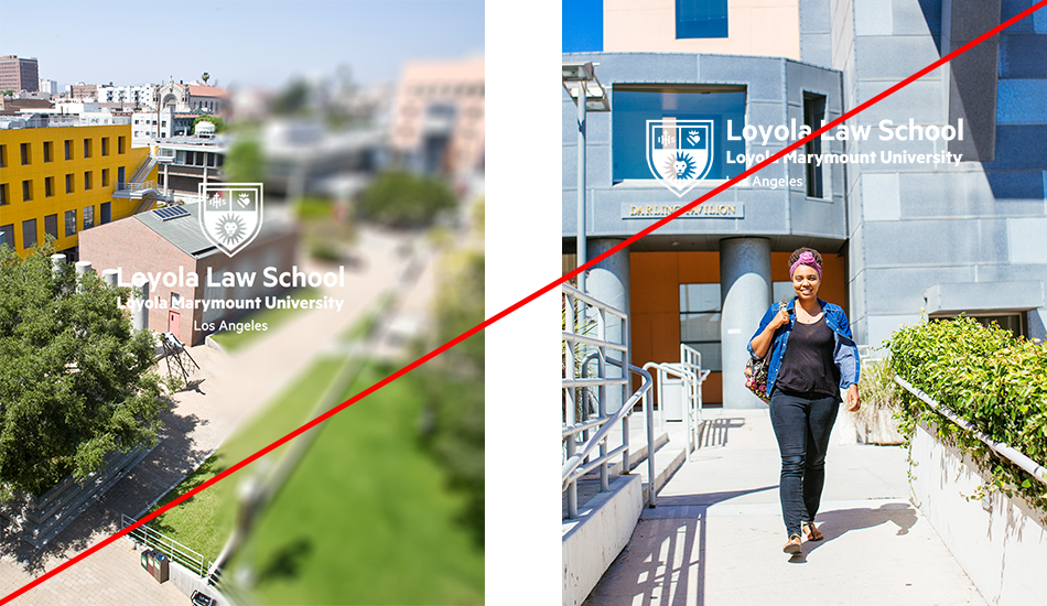
The Loyola Law School identity cannot be applied to backgrounds with solid colors outside the university color palette, patterns, or visually competitive photographs.


Correct Logo Usage over Photographic Backgrounds
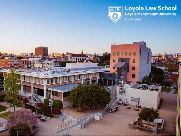
The LLS identity can be applied directly over photography and illustrations with non-competitive backgrounds, such as open sky or solid-color building.

Incorrect Logo Usage over Photographic Backgrounds
Do not place the identity over visually-competitive photography backgrounds.
